DMZ Digital Community
Web app redesign: Portal 2.0
project
scope
The DMZ hub was launched in 2015 as an internal web platform to act as a guide for all companies within the startup incubator. The digital hub provided relevant resources and was most commonly used by startups for membership and operational procedures. However, the platform quickly faded away into the background and failed to provide a purpose to its users. In mid 2018, it was evident that the hub required a shiny user-first experience.
user
research
Research and findings
In its original state, the hub had outdated branding, leveraged a complicated user flow and lacked user value.
I conducted a range of in-person and online interviews to understand how the target audience was interacting with the existing platform. The key findings were:
No real transfer of knowledge due to which returning users were low
The UX was complicated making navigating through the platform frustrating
Startups were only using it when they had to extend their membership since everything else was hidden in the complex user flow
Entrepreneurs admitted to never using the platform or being unaware of its existence altogether
journey
map
The portal required a complete overhaul to offer a more valuable, user-friendly and community-driven experience while being aligned with DMZ’s refreshed brand.
user
personas
the approach
underlying idea
After the user research, I created two different personas of the founder and a staff member.
I put the user personas into the user journey map to evaluate a typical day from the user’s perspective. This helped me understand how the portal can streamline their overall physical and digital experience with the DMZ.
I used the research to synthesize all my findings and create the following main goals.
My role in this project included ideation, concept development, content strategy, site architecture, UX design and UI design.
Site architecture and UX flow
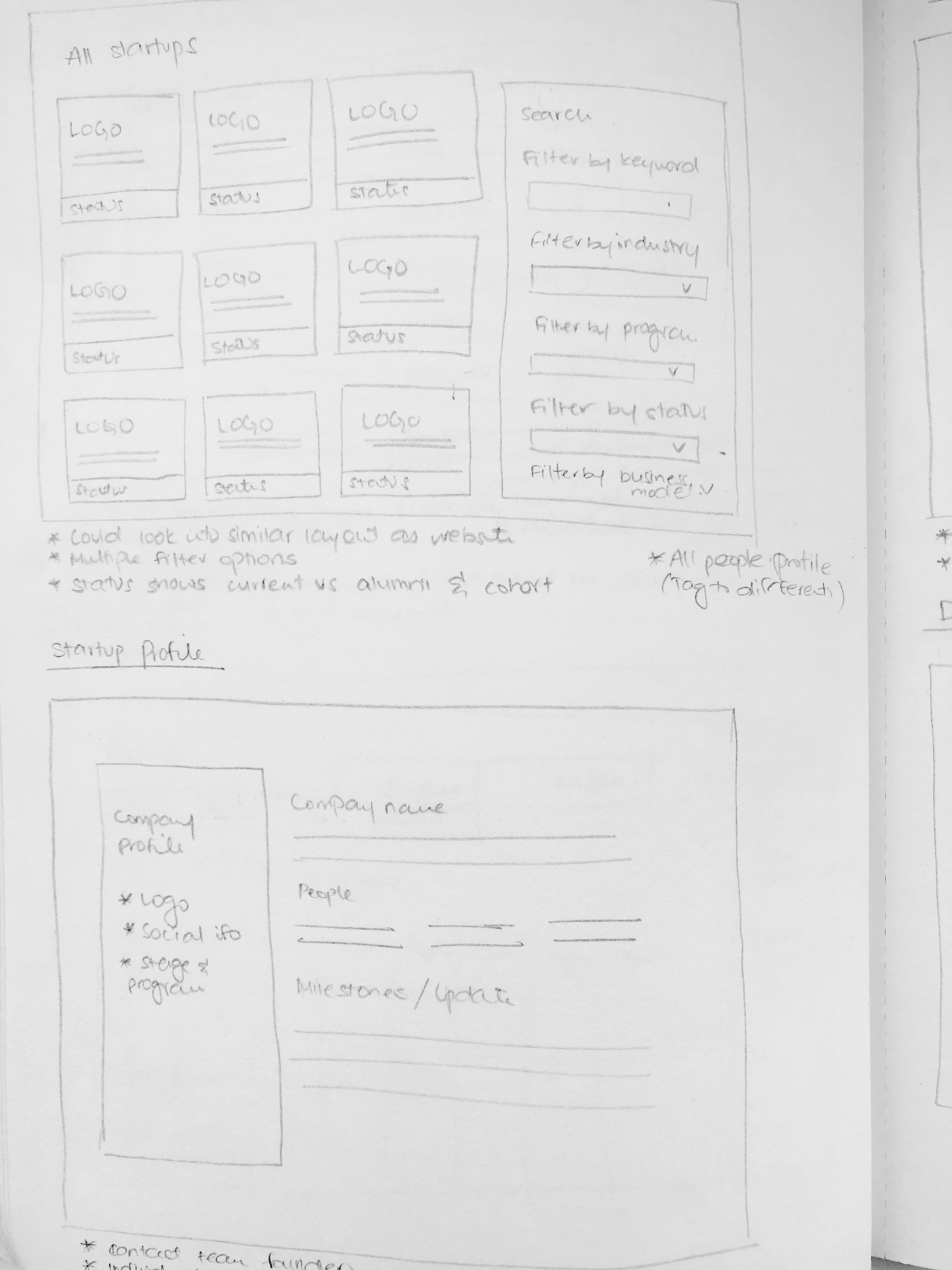
With the amount of information the hub had to communicate, card sorting allowed to gather all the content buckets and decide potential website navigation paths. Low fidelity mockups were developed which included step-by-step user interaction and the website architecture.
UI design
After multiple feedback and user testing sessions, the low fidelity mockups were revised to produce the finalized product. This included a style guide covering all aspects such as visual language, iconography, photography and design patterns. The UI was carefully designed to mimic the clean, yet bold personality of the DMZ brand.


